Visual Guidelines

Logo
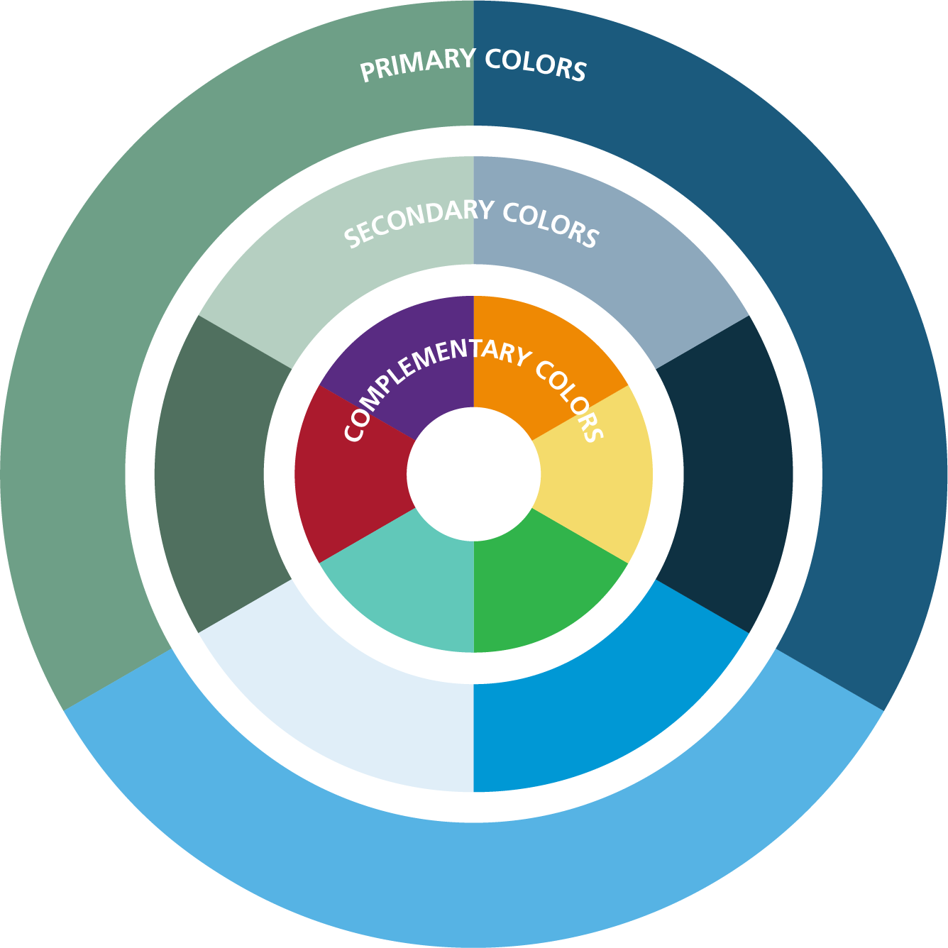
The AUA has adopted a “Masterbrand” strategy. This means that the AUA will be represented by one logo and brand name. Our individual products, services and offerings are not individually branded. The AUA Masterbrand is trademarked and has a distinct promise, position and personality, and a visual and verbal system. All individual products and services are marketed under this Masterbrand. Under the Masterbrand strategy, when we launch a new product or service, it uses the same tagline and visual identity system (colors, typography, etc.) as the Masterbrand.
The creation of new logos to designate the Association, a department, a product, or a service is not allowed. We will develop a product/service signature using the AUA brand guidelines (i.e., colors, fonts) in certain unique situations. Such signatures will never deviate from the AUA Masterbrand.
OUR LOGO
EXCLUSION ZONE
Allows an exclusion zone of 1/2 of the height of the logo
MINIMUM SIZE
IN PRINT - NO SMALLER THAN 1/2” IN HEIGHT
IN DIGITAL - NO SMALLER THAN 45 PIXELS IN HEIGHT
Our goal is to drive towards a strong and confident one-color version of our logo.
This Primary Blue version is to be used across all marketing material such as advertising campaigns, promotional videos and print collateral.
PRIMARY BLUE
PMS: 7700 C
CMYK: 84–17–0–57
HEX: 00567A
RGB: 0–86–122
The logo can appear in white when sitting on certain colors within our color palette or photography. These are colors that allow high contrast between the logo and color.
Logo Examples
Colors
Color is a powerful tool that helps increase awareness and recognition, while leaving a lasting impression on our audience.
Over the past decade, our consistent use of these primary brand colors made our communications more recognizable.
Primary Colors
PROPORTIONAL COLOR USAGE
When using colors for AUA brand collateral, careful consideration should be given to ensure that blue remains the lead color, with the secondary and complementary colors providing support and definition to the design.
This wheel offers a visual sense of how to apply color when designing with our brand.
Primary Colors
Our primary colors should be the dominant colors in all our communications. They do not need to appear at all times, on every page, slide or frame of each brochure, digital presentation or video, but our primary colors should remain prominent throughout our products.
Secondary Colors
This color palette can be the dominant color on a single page or graphic as long as a primary color is also present. It can be used to add contrast to the primary color palette.
Complementary Colors
Accents of color can be added into our design communications by using the complementary color palette. They should be used sparingly and should not replace the primary color palette in a piece of work.
Complementary Color Usage
Accents of color can be brought into our design communications by using the complementary color palette. They should be used sparingly and should not replace the primary color palette in an overall piece of work.
Here you can see examples of how accents of color can be used to add another level to the design, enabling key information to stand out and to keep our materials looking fresh, relevant and interesting.
COLOR SPECIFICATIONS
PMS: 7700 C
CMYK: 84–17–0–57
WEB: 00567A, 0–86–122
PMS: 2915 C
CMYK: 59–11–0–0
WEB: 62B5E5, 98–181–229
PMS: 556 C
CMYK: 62–10–55–0
WEB: 6FA287, 111–162–135
PMS: 289 C
CMYK: 93-70-50-50
WEB: 092640
PMS: 801 C
CMYK: 100-25-0-19
WEB: 009ACE
PMS: 5615 C
CMYK: 12-0-7-53
WEB: 6A7970
PMS: 50% 7700 C
CMYK: 23-10-0-26
WEB: 91AABC
PMS: 50% 2915 C
CMYK: 24-10-0-5
WEB: B7D9F2
PMS: 50% 556 C
CMYK: 12-0-7-18
WEB: B6D0C1
PMS: 144 C
CMYK: 3-49-100-0
WEB: ED8B00
PMS: 268 C
CMYK: 79-100-0-0
WEB: 582C83
PMS: 187 C
CMYK: 0-100-74-26
WEB: A6192E
PMS: 127 C
CMYK: 7–18–62–0
WEB: FBE682
PMS: 570 C
CMYK: 54-0-30-0
WEB: 6BCABA
PMS: 361 C
CMYK: 68-0-100-0
WEB: 43B02A
Color Overlays
We will be incorporating color overlays into our overall designs. Adding screens of brand color over photography adds texture and visual interest to the designs.
Fonts
Primary Typefaces
When available, the AUA primary typefaces should always be used.
  • Frutiger LT Pro
  • Berthold Baskerville and Baskerville Book
  • Old Standard
Alternate Typefaces
Generally our core fonts are not found in the standard Microsoft Office suite. Most brand fonts are not, so this is quite common. When using the Microsoft suite, we suggest you use these fonts:
  • Arial – to replace Frutiger LT Pro’s non-condensed styles
  • Arial Narrow – to replace Frutiger LT Pro’s condensed styles
  • Baskerville Old Face – to replace Berthold Baskerville & Berthold Baskerville Book
WEB TYPEFACES
The availability of the Old Standard font in Google font database allows us to now use a serif font in our websites. For sans serif, we will use Frutiger Web fonts. The above alternate fonts will be used as the substitute fonts for websites when needed.
LICENSING AND ACCESS
You can download Old Standard through Google fonts. For questions about usage, contact AUA Help Desk.
WHEN TO USE WHICH FONT
FRUTIGER LT PRO
Frutiger LT Pro should be used when a sans serif font is needed. It may be used for headlines, “callout” text or body copy.
OLD STANDARD
Used primarily for the AUA logo. It may also be used for headlines or “callout” text when a serif font is appropriate. This font should NOT be used for body copy.
BERTHOLD BASKERVILLE BOOK
Berthold Baskerville Book should be used when a serif font is needed. It may be used for body copy, or as otherwise deemed appropriate by the design team.
EXAMPLE ORGANIZATIONAL STRUCTURE
AUA MISSION – VISION
Mission
To promote the highest standards of urological clinical care through education, research and in the formula­tion of health care policy.
Vision
To be the premier professional association for the advancement of professional urologic patient care.
PRIMARY TYPEFACES
FRUTIGER LT PRO
47 Light Condensed...AaBbCc123
48 Light Condensed Italic...AaBbCc123
57 Condensed...AaBbCc123
58 Condensed Italic...AaBbCc123
67 Bold Condensed...AaBbCc123
68 Bold Condensed Italic...AaBbCc123
77 Black Condensed...AaBbCc123
78 Black Condensed Italic...AaBbCc123
57 Condensed...The quick brown fox jumps over the lazy dog.
58 Condensed Italic...The quick brown fox jumps over the lazy dog.
45 Light...AaBbCc123
46 Light Italic...AaBbCc123
55 Roman...AaBbCc123
56 Italic...AaBbCc123
65 Bold...AaBbCc123
66 Bold Italic...AaBbCc123
75 Black...AaBbCc123
76 Black Italic...AaBbCc123
55 Roman...The quick brown fox jumps over the lazy dog.
56 Italic...The quick brown fox jumps over the lazy dog.
OLD STANDARD
Regular...AaBbCc123
Italic...AaBbCc123
Bold...AaBbCc123
BERTHOLD BASKERVILLE BOOK
Regular...The quick brown fox jumps over the lazy dog.
Italic...The quick brown fox jumps over the lazy dog.
Medium...The quick brown fox jumps over the lazy dog.
Medium Italic...The quick brown fox jumps over the lazy dog.
Photography
Our photography is engaging and powerful. It captures real life and is professional and diverse. It relays the medical expertise of our members, combined with their caring spirit.
The AUA has a photo bank of approved photography. We are constantly expanding and modifying this collection to ensure that we have the latest and highest quality photography available. All photography must be approved by the Marketing and Communications Division.
AUA PHOTOGRAPHY STYLE
IS:
  • Candid or natural-feeling
  • Generally light
  • Engaging
  • Warm, inviting
  • High quality
  • Visually dynamic and interesting
IS NOT:
  • Staged or set up
  • Cold, uninviting
  • Low quality
Examples
Our Tagline
An organization’s tagline is one of its most powerful tools in the overall branding toolkit. A strong tagline is your main calling card to your target audience. It tells everyone what you stand for and why you make a difference. In short, it is the best ad you will ever create.
TAGLINE STRUCTURE
To accommodate a variety of AUA values and initiatives, we have created a flexible tagline system. This will allow us to pick select words that we feel best represent a specific goal/audience and add it to the end of the core tagline. The AUA Tagline System consists of two levels:
  • The core tagline (Advancing Urology™)
  • Expanded taglines (i.e., Advancing Urology™ through insert approved word – i.e., Advancing Urology™ through Education)
This system and its consistent usage reinforce who we are as an organization and what our core values are. Additions to the core tagline cannot be made without express written permission from Marketing and Communications. If, within the approved list of tagline additions, there is not one that fits your specific needs, you may request a new addition from Marketing and Communications. All proposed tagline additions will be submitted to the Executive Team for approval. You may not use a tagline addition until you have received written approval from the Marketing and Communications.
STEP 1:
Develop a tagline addition that adheres to the approved structure (Advancing Urology™ through...):
  • Tagline must echo a value that is relevant to the AUA and not already highlighted in one of the existing approved tagline additions.
  • Tagline must reflect the personality/ voice/brand personality traits of the AUA.
  • Tagline addition is ideally one word, but a maximum of two words.
STEP 2:
Submit to Patricia Banks, Executive Vice President, and Chief Marketing and Development Officer, via email the following:
  • Requestor’s name and department
  • Proposed tagline
  • Rationale for new tagline necessity
  • EVPs written acknowledgment and approval of the request
STEP 3:
Marketing and Communications will coordinate review and approval with the Executive Team.
STEP 4:
You will be notified of approval or rejection. Please note you are not authorized to use the proposed tagline addition until you have received written approval.
GUIDELINES FOR USING THE TAGLINE
As with any identity element, thoughtful, consistent and careful application of our tagline will ensure its broad association with the AUA and support both the legal fact and the public perception of its ownership. The AUA tagline should be used on external and internal communications materials (print and electronic) only after review and by approval of AUA’s Marketing and Communications Division.
Our tagline is trademarked and should always be followed by the trademark symbol “™” when it appears as a tagline.
When used in copy:
The first “A” in “Advancing” and the “U” in “Urology” are always capitalized, and there is never a period or other punctuation in the tagline. The words “Advancing” and “Urology” must always have a space between them. The tagline should be italicized.
“Advancing Urology” is only followed by the preposition “through” and then only by approved tagline additions. As a general rule, additions will be no more than one word, and occasionally two words, after “through.” In tagline additions, “through” is never capitalized, but the subsequent words are capitalized. No punctuation is to be used.